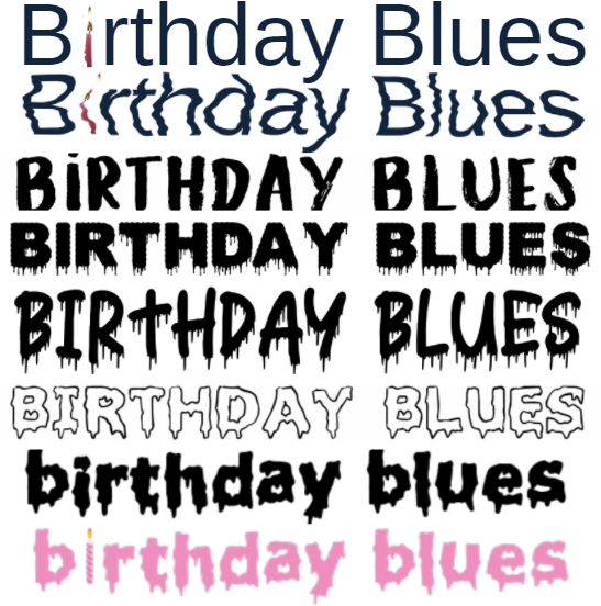
When it came to the font of our film opening title my group had originally planned out the first font in the picture below. The plan and depressing text paired with a bright birthday candle mirrored the plot of our film opening in which a pandemic commences on the main character's milestone sixteenth birthday. We also created a second font, the second one in the image, but was rippled much like a tear. Although my team did not love our font ideas, they still encapsulated the feeling of disappointment and uncertainty we hope to portray in our film however, we did not settle on them and kept an open mind.
We later came up with a variation of other fonts seen below the first two until we landed on the final font in the image. We tried out more youthful-looking fonts, played around with color, and even revised the idea of mirroring our film title font to a birthday cake. The pink 'birthday blues' font captures all the ideas we had concerning the font into one. It is bright and youthful but still has a sense of sadness to it as the letters appear to be melting away. Moreover, the candle in the 'i' reflects the loneliness that our main character is set to feel in our film opening.


No comments:
Post a Comment